
An expert role leads the model to a familiar result
One of the best-known pieces of advice for working with AI goes something like this:
You are an experienced marketer with ten years of experience. Analyse the audience and write landing-page copy.
You can swap the marketer for a designer, editor, lawyer, or any other professional. That is the point of the ritual: the phrase seems to activate everything the model knows about the experience of a great marketer.
Guides such as 1, 2 (in Russian), 3 (in Russian), 4 (in Russian), and 5, among many others, recommend a role as the opening line of a “good prompt.”
Yet AI output is often easy to recognise. A landing page opens with a big promise, splits its benefits into three cards, and ends with “Start your journey today.” Everything is tidy and in place—and you have seen it somewhere before.
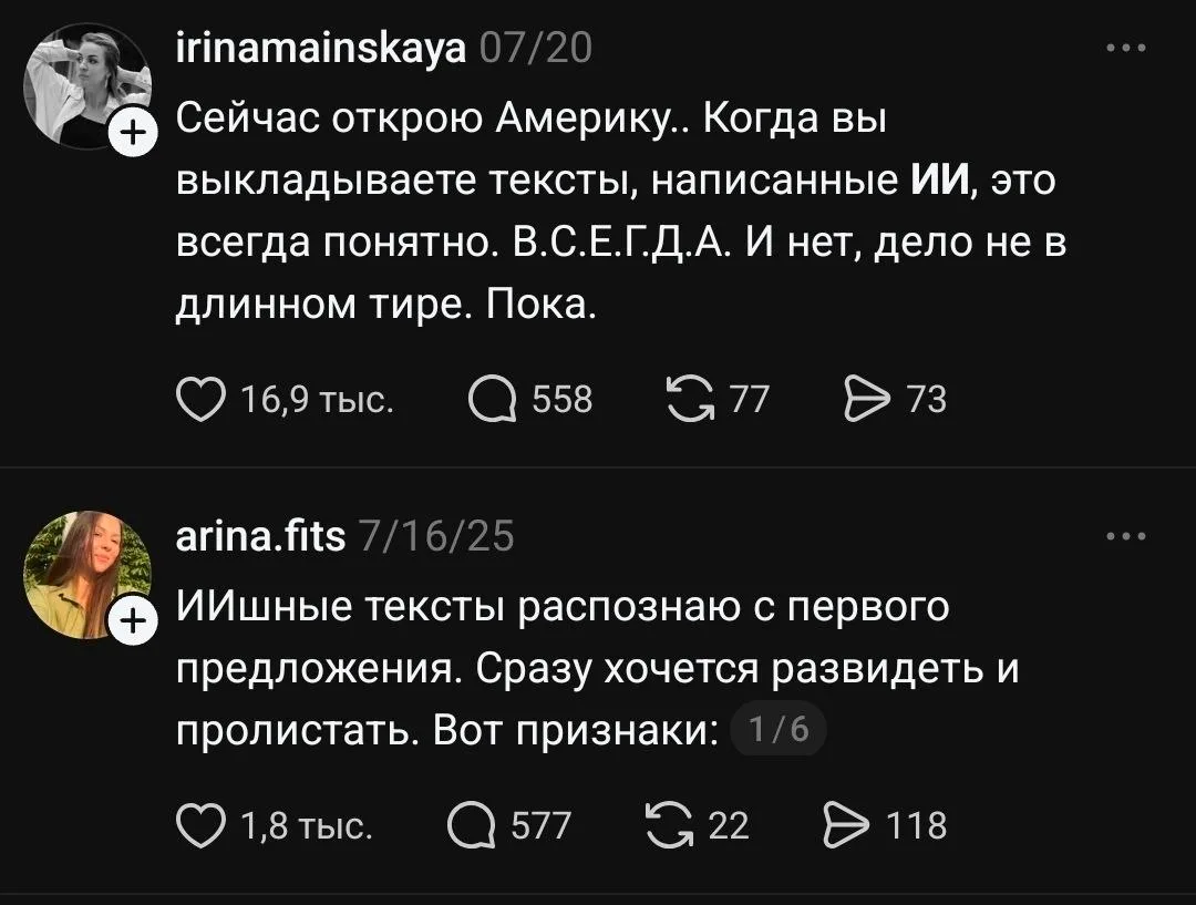
The source posts in this screenshot are in Russian. Both say that recurring wording and familiar devices make AI-generated copy easy to recognise.
Inspired by Anthropic’s research into the inner workings of language models, I turned that advice around. What happens if, instead of “act as an experienced designer,” you write “do not think about design patterns older than five years” or “avoid them”? My hypothesis was that it helps more to tell a model who it should not resemble than who it should be. I will call these avoided patterns an “anti-image.”
Rather than draw a conclusion from three lucky screenshots, I collected 281 results: 221 landing pages and 60 texts. In one part, the models worked as they normally would: creating files, viewing the page in a browser, and revising it. In another, Luna received the same conditions dozens of times while I changed one short line before the task. The most stringent test had only three prompts: “make a landing page,” “act as a designer,” and “avoid design patterns older than five years.”
A role did not improve the result in any independent check. In detailed tasks, models given a role returned to familiar compositions more often. In the short prompt, “Avoid” outperformed both the role and the bare prompt on originality, modernity, and visual quality. The texts showed a similar pattern: a specific anti-image increased originality and removed the listed clichés. Here is the evidence.[1]
How the hypothesis emerged and what the first three landing pages showed
A year ago, I taught people to start a prompt with a role. Want copy? Make the AI an editor. Want a page? Make it a designer. Add experience and a specialty. The advice looked sensible: I thought it activated the knowledge and techniques of the professional I needed.
Around November 2025, I stopped putting roles in my own prompts. I did not have research then. Increasingly, the line seemed to add nothing and sometimes pull the output towards familiar AI copy.
I removed the role and kept working without one. At the time, I could not explain that choice with numbers.
Later, I read Anthropic’s research into the inner workings of language models. In one experiment, a model was asked to think about a concept or, conversely, not think about it. The negative instruction weakened the concept-related internal activity relative to the positive one, though it did not eliminate it completely.
The research says nothing about landing pages and does not prove that negative instructions make responses more original. It did suggest a question: what would happen if we stopped assigning the model a profession and instead named the professional patterns it should avoid?
In a conversation with a colleague, we assembled three versions of one prompt. In the first, the model acted as an experienced designer. In the second, we asked it not to think about the familiar conventions of farm websites. In the third, to avoid them. We sent each prompt to the same model once.
The result looked almost too good for our hypothesis. The role-based landing page was neat and familiar. The other two were visibly different and felt fresher.
We could have placed the three screenshots side by side and declared “do not think” the new secret of prompting. One successful run is easy to mistake for a property of the prompt, though. The next generation might have reversed the result.
Contents
- An expert role leads the model to a familiar result
- How I evaluated the results
- A role makes the model repeat itself
- Roles did not help with text either
- Why “do not think” and “avoid” had a stronger effect
- How to write prompts that keep AI from repeating patterns
- Try it with your own prompt
The findings at a glance
You can safely remove “act as an expert” from most prompts. I tested it across 281 results. The role improved neither the texts nor independent evaluators’ scores for the landing pages. In the detailed design task, Luna with a role also repeated the same composition more often.
One short line was enough to produce stronger design. In the most stripped-down test, I kept only the task “create a landing page for a farm-produce delivery service.” I then added either a role or “Avoid design patterns older than five years” twenty times each. Sol and Terra rated “Avoid” higher on originality, modernity, and visual quality than both the role and the bare prompt.[2]
A detailed anti-image changed the result more sharply. In agent-built landing pages, “Avoid” increased visual spread by 1.80–2.74 times. In texts, “Do not think” and “Avoid” increased originality and reduced formulaic writing while keeping clarity and usefulness at roughly the same level.[3]
So how should you write prompts? Describe the task in ordinary, specific language: what is happening, what you need, and how you will judge the result. Name what should be absent as well: familiar compositions, worn-out words, predictable advertising openings. In the minimal test, “avoid design patterns older than five years” was enough to produce work rated as more original, more contemporary, and visually stronger than work generated with an experienced-professional role.
First, a brief account of how I measured this. Then you can look through the landing pages and compare the texts yourself.
How I evaluated the results
I collected 281 responses. The landing pages had three levels of context: . Within each comparison, the task, model, and tools stayed the same. Only the framing before generation changed.
Models built 41 pages in Codex: they created files, viewed the result in a browser, revised it, and chose their own tools. Luna made another 180 landing pages using one workflow: it first built the page, then revised it once after viewing it. Each prompt variant was repeated ten to twenty times.
Separately, Luna wrote 60 texts: three work tasks, four phrasings, and five responses for each. I measured design and text results separately; combining them into a single tidy number would not make sense.
These are the phrasings I compared. The final series deliberately reduces the difference to one short sentence:
No extra instructionBuild a one-page landing page using the specification below. Save every result file in the current folder. The landing page must open locally through
index.html.
RoleAct as a designer with 10 years of experience creating stylish, contemporary, conversion-focused landing pages. It should look like a real local B2C product that could launch in a city.
Do not thinkDo not think about design patterns older than 5 years. Do not rely on dated templates for farm shops, eco brands, grocery delivery, or food marketplaces.
AvoidAvoid design patterns older than 5 years. Avoid dated templates for farm shops, eco brands, grocery delivery, green-and-beige “naturalness,” and identical benefit sections.
No extra instructionThere is no additional line before the detailed task.
RoleAct as a designer with 10 years of experience creating contemporary, conversion-focused landing pages for local B2C products.
AvoidAvoid the following set of choices: dated templates for farm shops, eco brands, and grocery delivery; green-and-beige as the base palette; kraft paper and wooden boards as the main background; handwritten fonts; leaves in the logo; “100% organic” stamps; identical benefit cards with icons.
Role + avoidAct as a designer with 10 years of experience creating contemporary, conversion-focused landing pages for local B2C products. Avoid the same set of dated templates and visual choices.
The same listThe following choices are not suitable for this page: dated templates for farm shops, eco brands, and grocery delivery; green-and-beige as the base palette; kraft paper and wooden boards as the main background; handwritten fonts; leaves in the logo; “100% organic” stamps; identical benefit cards with icons.
Desired directionA rich seasonal palette, a clean light background with large fields of colour, expressive sans-serif typography, a wordmark, geometric markers, object-based SVG illustrations, and varied compositions for content sections suit this page.
No extra instructionA neutral detailed brief with no additional line.
RoleAct as a designer with ten years of experience.
AvoidAvoid design patterns older than five years.
Positive framingUse design patterns from the last five years.
No extra instructionCreate a landing page for a farm-produce delivery service.
RoleCreate a landing page for a farm-produce delivery service. Act as a designer with ten years of experience.
AvoidCreate a landing page for a farm-produce delivery service. Avoid design patterns older than five years.
In the detailed series, I added three more control variants: I combined the role with the same list of constraints, rewrote the list without the verb “avoid,” and separately listed the desired choices. This let me test the role, the wording, and the amount of detail in the prompt.

I published every prompt, source page, text, score, and calculation script on GitHub. It also contains full archives of all 281 results and file checksums.
221 landing pages: from a detailed brief to one sentence
In 41 runs, models worked as agents. The first sample included GPT-5.5, Gemini 3.5 Flash, Claude Sonnet 4.6, Sol, Terra, and two versions of Luna. Each of the seven models completed the “Role,” “Do not think,” and “Avoid” phrasings once. Luna High then completed all four conditions five times each. This part shows ordinary work in which the model chooses how to implement the task.
After that, I assembled three more series of 60 pages each. In the first, Luna completed the detailed brief with six phrasings ten times each. In the second, I added four short frames to a neutral brief, 15 times each. In the third, I left one sentence about the delivery service and three prompt variants, 20 times each.
Within each series, I saved first screens at the same size and compared every pair within a condition. In the agent series, RGB distance showed differences in palettes and large colour fields. dHash distance compared the screens’ overall geometry. In the three large series, the main metric was DINOv2. It compares pages as complete images. I cross-checked the result with colour, perceptual hashing, and edge maps.
Sol and Terra received finished pages under random numbers and independently scored them from 1 to 5. Depending on the series, they assessed originality, modernity, visual quality, clarity of the proposition, task completion, and technical integrity. I did not combine these scores with visual spread: pages can differ greatly from one another and still be poor.
I did not treat 45 pairs as 45 independent observations. On every recalculation, the algorithm resampled groups from the source pages. I tested differences between prompts by permuting their labels; the Holm correction filtered out chance findings from multiple comparisons.
60 texts: three tasks, four phrasings, five repetitions
For the texts, I kept the same Luna High and three ordinary work tasks:
- landing-page copy for an urban leisure service;
- an explainer about switching attention after mental work;
- an email from a neighbourhood library about a houseplant swap.
Each task received four conditions and five independent responses: 3 genres × 4 conditions × 5 runs = 60 texts. For each set of five, I calculated all ten pairs. The vocabulary of full responses was compared with TF-IDF similarity, headlines and CTAs with the token Jaccard coefficient. A structural index compared the scaffolds, and an automated detector looked for categories of clichés specified before generation.
All 60 texts then received random numbers and went to two AI evaluators, Sol and Terra. They did not know which prompt preceded a text. Each separately assessed task completion, clarity, specificity, practical usefulness, originality, and the number of formulaic devices. I did not turn these attributes into one overall score: an original text can fulfil the task poorly, and the reverse is also true.
Across the study, I kept three checks separate:
- how much responses within one condition differ from each other;
- how far they move away from familiar genre patterns;
- how well the result fulfils the task itself.
I will start with landing pages: the difference between a role and an anti-image is visible there even before the charts.
A role makes the model repeat itself
The “No extra instruction” and “Role” pages quickly reveal a family resemblance: a light background, a large headline on the left, a box of vegetables on the right, and coral and green accents. The font, line breaks, and illustration details change, yet the overall direction remains familiar.
In “Avoid,” the deck starts behaving differently. A white-and-red poster, a bright yellow screen, a light composition with a sculptural box, and two dark aubergine versions appear next to each other. These pages still solve the same detailed task. It is harder to take them for variations on one template.
With a role, Luna repeated the same composition more often
I arranged twenty Luna landing pages into a matrix: four conditions with five independent runs each. With the role line, all five arrived at a light hero, a large promise on the left, and an illustrated box on the right.
Without additional framing, Luna varied 11–28% more. The role more often brought it back to one solution: light background, large headline on the left, box on the right.

The calculation confirmed what was visible. The median distance for “No extra instruction” was 0.159 versus 0.124 for “Role” on RGB, and 0.313 versus 0.281 on dHash. The higher the number, the less similar the pages are to one another.
“Avoid” produced 1.8–2.74 times more distinct directions
In “Avoid,” differences show up in almost every pair. The palettes, typography, card shapes, and product metaphors changed. All five pages still sold a vegetable subscription, though it would be hard to call them close relatives.
This cannot be explained by one outlier: the difference remained in both the mean and the median. In colours and large fields, “Avoid” produced 2.52–2.74 times more spread than the task without extra framing. In overall screen geometry, it produced 1.80–1.95 times more. The median rose from 0.159 to 0.435 on the first metric and from 0.313 to 0.609 on the second.

The list was specific: dated farm-shop templates, green-and-beige “naturalness,” identical benefit sections. With it, the five attempts diverged the most.
One dark landing page inflated the average “Do not think” result
In the first stage, where seven different models made one landing page each, “Do not think” looked like the strongest condition. Simply browsing the pages showed the widest set of directions, and it led on mean pixel distance. That suggested an appealing conclusion: a negative instruction immediately broadens the search.
Five repeats from one Luna showed a different picture. Four “Do not think” pages were similar and light. The fifth switched sharply to a dark green screen and lifted the group average. The median pixel distance was even slightly below the role’s: 0.115 versus 0.124.

This screen was one of the study’s most useful results. From a single generation, I could have attributed a stable property to the instruction. Five repeats revealed a rare branch: in the other four attempts, nothing similar happened.
One brief produced different compositions, palettes, and metaphors
Even the most different pages retained the brief’s scaffold: hero, box contents, three steps, subscription sizes, a story about seasonality, and a final CTA. The anti-image changed the expression of that scaffold. Cards became lists, pricing tiers became a configurator, a calendar became a diagram; colour, typography, rhythm, and the object metaphor were reworked.
Visual freshness did not guarantee a page ready to launch. Mean technical-readiness scores in the multi-model series remained in a narrow 3.00–3.29 range out of 5. Some expressive versions lost the route to conversion or broke on a narrow screen. The flow, copy, and responsive behaviour still needed a separate check.
In the detailed brief, the role again produced similar pages
Here, Luna received the same detailed task, identical tools, and exactly two chances to revise the page each time. I repeated every prompt variant ten times.
With a role, pages were about 9% closer to one another than without it. The detailed anti-image produced 7–15% more spread. The difference was smaller than in the free agent workflow.[4]
The broadest set came from the role combined with the same anti-image. The ordinary phrase “the following choices are not suitable for this page,” with exactly the same list, performed similarly to “avoid.” The list of unwanted choices itself mattered here. The choice of verb made almost no difference.

One line—“avoid old patterns”—was enough to beat the role
There is a fair question here: the role had one short sentence, while the anti-image had a long list of details. Perhaps the list won simply because it gave the model more information. So I assembled a separate series of three nearly empty prompts:
No extra instructionCreate a landing page for a farm-produce delivery service.
RoleCreate a landing page for a farm-produce delivery service. Act as a designer with ten years of experience.
AvoidCreate a landing page for a farm-produce delivery service. Avoid design patterns older than five years.
Luna completed each prompt twenty times. Sol and Terra then received the pages under random numbers. They did not know where the role and anti-image had been used.
“Avoid” beat the role on all three main scores: +0.45 points in originality, +0.33 in modernity, and +0.30 in visual quality. Compared with the bare prompt, the differences were +0.55, +0.38, and +0.33. Additional recalculations did not change the figures.[2:1]

In the minimal prompt, the short “Avoid” received the highest Sol and Terra scores on the three main criteria.
The pages within the three groups were about equally varied. The short boundary shifted the whole group towards fresher design without making the twenty attempts more chaotic. In the detailed neutral brief, the same line had a much weaker effect: the more direction was already specified in the task, the less one additional sentence changed.[5]
The landing pages showed two effects. In the detailed agent task, the anti-image produced more visual directions. In the minimal prompt, one short sentence was enough to make pages look more original, more contemporary, and stronger, while overall spread barely changed. Next, I removed colour, images, and layout from the equation and tested the same phrasings on 60 texts.
Roles did not help with text either
Changing tasks is not recovery
The same subheading in all five role-based articles.
One more headline recurred in four of the five responses. The role clearly nudged the model towards a familiar editorial frame. Headlines alone were too little for a conclusion, so I checked vocabulary, structure, and calls to action across all 60 texts.
With and without a role, texts were equally varied
First, I looked at how similar the vocabulary was across the five responses within each condition. For this I used TF-IDF vocabulary similarity: the higher the value, the more often the model returns to the same words.

I recalculated the similarity six ways. The result did not change: full texts with and without a role were equally varied.[3:1]
Full texts varied; individual headlines and buttons recurred
Different words do not necessarily mean genuinely different texts. A model can repeat one subheading, arrange its arguments in the same way, or lead to the same button. So I compared those elements separately.
Four notable repetitions appeared in role-based responses:
- in the articles, one subheading appeared in all five responses;
- in the emails, role-based texts had the most similar structure among the four conditions;
- one set of CTA words appeared in all five role-based emails;
- the button “Register for the swap” appeared in four of five role-based emails.
The role did not turn all three genres into a single template, however. The same button appeared in four of five “Avoid” emails, while headlines in product landing-page copy repeated more without additional framing: 0.733 versus 0.547 with “Role.” The role pulled together individual elements, not every whole text.
In the 30 texts with an anti-image, none of the listed clichés appeared
Before generation, I wrote down a few recognisable formulas for each genre:
- for the landing page: a rhetorical question in the first line, a promise to change your life, “no more,” a trio of abstract benefits, and a “start your journey” CTA;
- for the article: “does this sound familiar?”, the fast pace of modern life, simple secrets, a universal list of tips, and the conclusion “the main thing is to start small”;
- for the email: “dear friends,” a long-awaited event, exclamation marks, an unforgettable atmosphere, piles of adjectives, and an appeal to reserve a place before it is too late.
The automated check found six matches in “No extra instruction” texts and eight in role-based texts. In the thirty “Do not think” and “Avoid” texts, it found none.

Five of the six hits without additional framing were exclamation marks in emails. With the role, they appeared in all five emails; “dear friends” and two abstract trios of benefits in landing pages joined them. The listed clichés did not occur in the explanatory articles at all.
The list worked literally: the model saw concrete formulas and went around them.[3:2]
The anti-image made texts more original and less formulaic
Two AI evaluators independently read all 60 texts. They saw the task, text, and criteria, but did not know which prompt Luna had received.
The role changed almost nothing: −0.03 points in originality and the same amount on the formulaic-language score.
The anti-image shifted the scores more noticeably. “Do not think” added 0.57 points to originality and reduced the formulaic-language score by 0.73 points. “Avoid” produced +0.40 and −0.53.
Task completion, clarity, specificity, and practical usefulness barely changed. The anti-image affected originality and formulaic moves in particular.[3:3]

Sol and Terra independently assessed 60 texts. The anti-image increased originality and reduced formulaic language; other qualities barely changed.
I found no difference between “Do not think” and “Avoid”
“Do not think” received slightly stronger scores, but the difference varied by task and was too small to choose a winner.
Both phrasings contained the same detailed anti-image: an unwanted opening, familiar promises, structure, tone, and CTA. That list best explains the overall result.
None of the 20 emails reached the required 300 words
All twenty explanatory articles fell within the 450–650-word range. Fourteen of 20 responses met the landing-page length requirement. The emails had to be at least 300 words. None made it: the mean length across the four conditions ranged from 262 to 278 words.
A high originality score did not make up for that shortfall. The anti-image helped control recognisable devices, while compliance with the brief still needed separate checking.
The texts followed nearly the same pattern as design: the role added little to a detailed task, while the anti-image noticeably shifted originality and formulaic language. The remaining question is why.
Why “do not think” and “avoid” had a stronger effect
By the time Luna read “act as a designer,” it already understood the task. The brief included the product, audience, page structure, hero, subscription flow, and requirements for the visual language. The word “landing page” alone carried thousands of familiar examples.
The role led towards the centre of the genre: make it as an experienced professional would. A light hero, a large promise, a box on the right, and an obvious CTA became an entirely logical response. The detailed brief led Luna to much the same place even without the role.
The anti-image closed off several familiar roads: green-and-beige “naturalness,” dated farm templates, identical benefit cards, and familiar advertising openings. Many other routes remained open.
In free work on the detailed brief, the anti-image separated the pages into different compositions and palettes. In the minimal prompt, it shifted the whole group towards fresher design: Sol and Terra scores rose, while the distance between twenty pages barely changed. A model can move away from a familiar solution as a group without becoming more chaotic.

Freedom of action also seems to have affected the result. In Codex, the model could create images, rebuild the page, and choose tools. In the series of 60 identical runs, it was limited to local HTML, CSS, JavaScript, SVG, and two turns for the whole page. The anti-image again separated results slightly, though the gap was smaller. It appears to benefit especially from the ability to realise a different visual path.[4:1]
This diagram describes finished responses. Anthropic’s research suggested what might have happened between prompt and result.
The anti-image may have weakened the trace of familiar patterns
In Anthropic’s research, Claude Opus 4.1 was asked to rewrite a neutral sentence while thinking or not thinking about aquariums. After “do not think,” the trace of aquariums in the response was weaker than after the instruction to think about them. By the model’s last layer, it returned to baseline.
In my experiment, aquariums were replaced by green-and-beige “naturalness,” dated farm templates, identical cards, and familiar textual openings. The model received a precise list of routes to avoid.

That leads to a working explanation of my results: the anti-image closed short roads to a familiar response, leaving the model more ways to fulfil the task. I did not measure Luna’s internal activations, so this remains a hypothesis.[6]
Other research also found no stable improvement from roles
My result fits a wider picture. The authors of When “A Helpful Assistant” Is Not Really Helpful tested 162 personas and 2,410 questions: on average, a role did not improve accuracy. In Principled Personas, expert roles sometimes helped, but the effect often did not hold up, and extra detail could substantially worsen the response. Another study, When Does Persona Prompting Actually Help?, tested 38 roles on 1,140 questions. The mean difference was again small: roles increased apparent expertise while reducing clarity.
Those studies measured different things: accuracy, depth, and clarity of responses. I looked at visual spread, quality, vocabulary, and clichés. The findings converge on one point: “act as an expert” is not a universal enhancer. A role can set a useful perspective, make no difference, or bring along unnecessary expectations.
So should you write “avoid” or “do not think about”?
According to the text series, it makes no difference. “Do not think” and “Avoid” were separated by only 0.04 points, and their medians were identical.
I will write “avoid” because it is the more natural way to say it. I would tell a designer, “Avoid these patterns.” “Do not think about these patterns” would sound odd. The key is to list the specific choices that should not appear in the result.
How to write prompts that keep AI from repeating patterns
I stopped treating a role as the obligatory first line of a prompt long ago, and the study confirmed that choice with numbers. When I need to compose a prompt, I explain the task to a smart colleague: what is happening, what result is needed, who will use it, what is already known, and which constraints matter.
There is no universal framework for that conversation. One prompt fits in a paragraph; another needs examples, files, and long context. A good prompt gives the AI enough information to understand the situation and the expected result.
You can add an anti-image to that account in one natural sentence. Sometimes it is enough to write:
Avoid design patterns older than five years.
In the minimal test, that one line was enough: Sol and Terra rated originality, modernity, and visual quality higher. You need a detailed list when you already know which clichés and choices you want to exclude.
When I know in advance which template bothers me, I name it more precisely. For text, that might mean rhetorical questions, “dear friends,” antitheses, trios of abstract benefits, and a “start your journey” CTA. For design, a purple hero and identical cards. These details are easy to check in the finished result.
The prompt itself remains an ordinary human explanation:
We are building a landing page for an urban subscription to seasonal vegetable boxes. People choose a box size and receive it weekly. The page needs to explain the contents, the three subscription steps, size options, and seasonality. We want a contemporary local product with a clear ordering flow. Avoid design patterns older than five years and the familiar green-and-beige farm aesthetic.
It contains the situation, desired result, and a boundary that keeps the model from turning to the first familiar template. A special block order and a role with ten years of experience add nothing here.
A role can still be useful when it genuinely sets a perspective. For example, asking someone to review an interface from an accessibility editor’s perspective changes the angle of review. I usually explain right away what to check: labels, error messages, whether fields are required, or whether meaning depends on colour. That clarification is more useful than the job title itself.
For an important task, I also make several independent attempts. One response may be a rare outlier, like the dark “Do not think” landing page in this experiment. Repeats help reveal the range and select a solution that fulfils the task without returning to the named anti-image.
In short, tell the AI in detail what you want and what is happening. If a recognisable template is already looming ahead, name it and ask the model to take another route.
Try it with your own prompt
Paste a prompt that includes “act as.” The AI will preserve the task and turn the meaning of the role into concrete requirements for the result.
The study includes 221 landing pages and 60 texts. The landing pages consist of 41 agent runs and three matrices of 60 pages: a detailed brief with six phrasings, a neutral brief with four short frames, and a minimal task with three prompts. Each matrix was analysed separately. One Luna High created the repeated series, so the exact magnitudes cannot be transferred to every model. ↩︎
The minimal series had 20 pages per condition. Sol and Terra independently rated anonymised pages on five-point scales. For “Avoid” relative to the role, the differences were
+0.450in originality,+0.325in modernity, and+0.300in visual quality; relative to the bare prompt,+0.550,+0.375, and+0.325. All six 95% bootstrap intervals lie above zero; p after Holm correction <0.05. Sol and Terra agreed on the direction of all six comparisons, even though they applied the scale differently in practice. The results held after removing three pilots and technically problematic C1 run 08. ↩︎ ↩︎Sol and Terra independently scored all 60 texts under hidden numbers. “Do not think” increased the overall originality score by
0.57points and reduced the formulaic-language score by0.73; for “Avoid,” the changes were+0.40and−0.53. After Holm correction, four findings remained statistically significant. The effect size for “Avoid” varied noticeably between evaluators. No confirmed differences appeared in task completion, clarity, specificity, or practical usefulness. The automated search6 / 8 / 0 / 0checked only the cliché categories specified before generation. ↩︎ ↩︎ ↩︎ ↩︎In the detailed matrix, groups were compared using two variants of DINOv2. The role was
0.91×the spread of the task with no extra instruction; detailed “Avoid” was1.07×and1.15×. The intervals include zero after correction for multiple tests. These numbers describe direction within the series. The agent-run1.80–2.74×values were calculated using RGB and dHash in another environment, where models could create images and work more freely with tools. ↩︎ ↩︎In a separate matrix, the same short line was added to the detailed neutral brief. Across 15 pages per condition, “Avoid” relative to the role scored
+0.20in originality,0.00in modernity, and+0.17in visual quality; after Holm correction, the differences did not hold. There is also no clear difference relative to the bare brief. This series shows that the effect depends on the context already provided. ↩︎Anthropic measured cosine similarity between internal activations on response tokens and a vector for the concept “aquariums.” Its experiment supports the idea that a negative instruction can weaken the trace of a named concept in Claude; it does not demonstrate the same mechanism in Luna or a direct connection to originality of the result. ↩︎